Astrodata · Omni
Sales enablement · 2026

AXIOM healthcare demo guide.

A walkthrough and talk track for Omni sales in healthcare conversations. AXIOM is the proof of what’s possible when Tuva, Snowflake Cortex, and Omni come together.

Open the live demo

Or read the walkthrough below first, the guide doubles as your script. Prefer to watch? Here's a video walkthrough.

The demo
High-Risk Patient Command Center
The stack
Tuva · Snowflake Cortex · Omni
The outcome
Five-minute partner-attribution story
01 · The product

What is AXIOM?

A High-Risk Patient Command Center that predicts and prevents costly health events before they happen.
Data foundation

Tuva

Open-source, dbt-native data marts that transform raw claims into risk scores, costs, quality measures, and utilization metrics. Six marts profiling every patient.

AI / ML layer

Snowflake Cortex

Native ML classification for readmission prediction. Anomaly detection for spend alerts. All in SQL, no PHI leaves the building.

Analytics experience

Omni

Population dashboards, care manager worklists, patient drilldowns, AI-driven narratives on every screen, and conversational analytics. Plus writeback, interventions push from analytics back into the care team’s system of action.

02 · The user

Sarah, care manager.

Who is she: RN with 8 years of clinical experience and 3 years in care management. She manages a panel of about 200 high-risk patients across CHF, COPD, and diabetes.

Her job: prevent expensive health events by reaching patients before they deteriorate.

Her goals

  • Know which patients to call today, ranked by who is most likely to have a bad outcome.
  • Complete patient picture in one place, no toggling between three or four systems.
  • AI-assisted intervention recommendations, not starting from scratch every call.
  • Close HEDIS care gaps proactively, not reactively.
  • Reduce readmissions and ER utilization, directly improves her performance metrics.
03 · Without AXIOM / With AXIOM

What she deals with today, and how AXIOM solves it.

What she deals with today

  • Morning routine
    Printed reports or clunky Excel exports. No reliable way to prioritize who to call first.
  • 30 to 40 percent overhead
    Toggling between three or four systems to piece together one patient’s story: claims, labs, pharmacy, quality gaps.
  • No predictive signal
    Finds out a patient was readmitted after it happens. Always reactive, never preventive.
  • Gut-based triage
    Goes by instinct, recency of discharge, or supervisor flags. No ML-ranked prioritization.
  • Blind to performance
    Measured on HEDIS scores and total cost of care, but has no real-time visibility into either.

How AXIOM solves her problems

Her problem AXIOM’s answer Powered by
Doesn’t know who to call first ML-ranked worklist by readmission probability Cortex ML.CLASSIFY on Tuva data
Info scattered across 4 systems Single patient profile with everything Tuva’s 6 data marts normalized
No predictive signal 30-day readmission risk score, refreshed nightly Cortex ML, native, no MLOps
Starts from scratch each call AI-assisted care summaries and recommendations Omni narratives
No cost or quality visibility Population dashboard with anomaly detection Cortex Anomaly Detection + Omni
Can’t ask ad-hoc questions Conversational analytics across the data Omni conversational analytics
04 · The demo flow

End-to-end journey.

One continuous story, told from Sarah’s point of view. Five screens. About five minutes.
Stage 01

Population dashboard

Sarah sees the regional anomaly. Cortex flags it.

Stage 02

Cohort analysis

She drills in. Understands what’s driving the cost spike.

Stage 03

Patient worklist

Her prioritized queue. ML-ranked by Cortex.

Stage 04

Patient profile

Full picture. Deploys care pathway in one click.

Stage 05

Care pathway live

Interventions assigned to the care team. Cortex re-scores in 7 days.

05 · Screen by screen

What to show. What to say.

Screen 01

Population dashboard

Sarah’s morning view. The dashboard tells her where the problem is before she has to look for it.
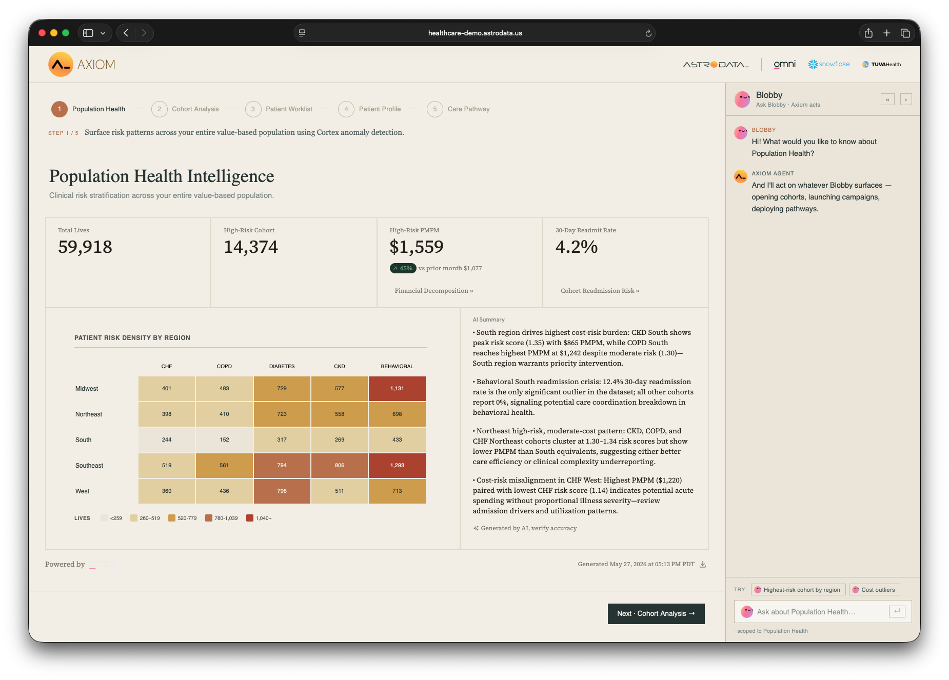
AXIOM Population Health Intelligence dashboard with a regional × condition risk-density heatmap, top-line KPIs, and an AI Summary panel.

What the buyer is seeing

Population-level risk stratification across roughly 60,000 attributed lives. Top-line KPIs: 14,374 high-risk patients, $1,559 PMPM, 4.2 percent 30-day readmission rate. A risk-density heatmap breaks the population by region and chronic condition. An AI Summary panel on the right flags the highest-risk cohorts and the most urgent patterns. Click any cell to drill into that cohort.

What to say

Lead with
"Sarah doesn’t open three reports anymore. She opens this. Snowflake Cortex flagged the anomaly, and Omni wrote the summary and surfaced it all in one view."
If asked "What’s the metric here?"
PMPM means per-member-per-month spend. It’s how risk-bearing organizations track cost per patient.
If asked "Is this real-time?"
Refreshed nightly. Cortex re-runs the risk model and anomaly detection against the full cohort overnight.
Don’t promise
Live streaming. The demo data is synthetic and refreshed in batch.
Partner moment
Cortex flagged the anomaly. Omni wrote the narrative and rendered the surface. Tuva normalized the data underneath. Three partners in one view, no glue code required.
Screen 02

Cohort analysis

CHF cohort deep dive. Cost drivers, utilization patterns, and an AI-generated narrative.

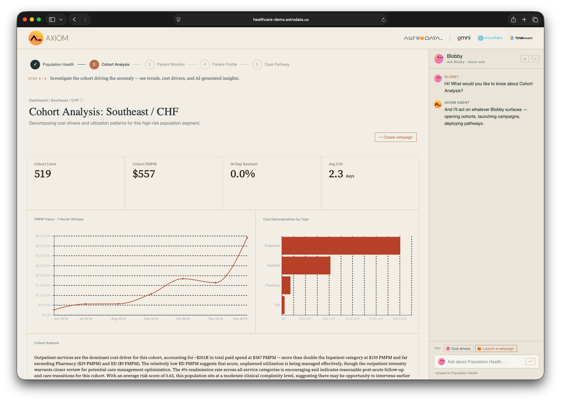
AXIOM cohort analysis for CHF showing PMPM trend, cost decomposition by type, and an Omni-generated narrative with Blobby sidebar.

What the buyer is seeing

Sarah clicked into the flagged CHF cohort. Top-line KPIs: cohort lives, PMPM, 30-day readmission rate, and average length of stay. A PMPM trend chart, cost decomposition by type showing where the spend is concentrated, and an Omni-generated narrative explaining the cost drivers. Blobby is active in the sidebar for follow-up questions, and a Create Campaign button is ready for the next step.

What to say

Lead with
"This is the moment Sarah goes from ‘who is at risk’ to ‘what is actually happening.’ She didn’t write SQL. She didn’t open a second tool. Omni took her one click deeper and wrote the explanation."
If asked "Where did the narrative come from?"
Omni’s AI layer, running against the Tuva data marts. The narrative regenerates as the cohort changes, no canned reports.
If asked "What’s the biggest cost driver?"
The cost decomposition chart shows the breakdown by type. The Omni narrative below the chart explains what’s driving the spend and where intervention priorities should focus.
Partner moment
Omni-generated commentary against the Tuva data foundation, rendered inside the same view as the chart. The whole "explain this chart to me" experience is one integration.
Screen 02·A

Create campaign

The writeback moment. Where Omni stops being a dashboard and becomes an action layer.

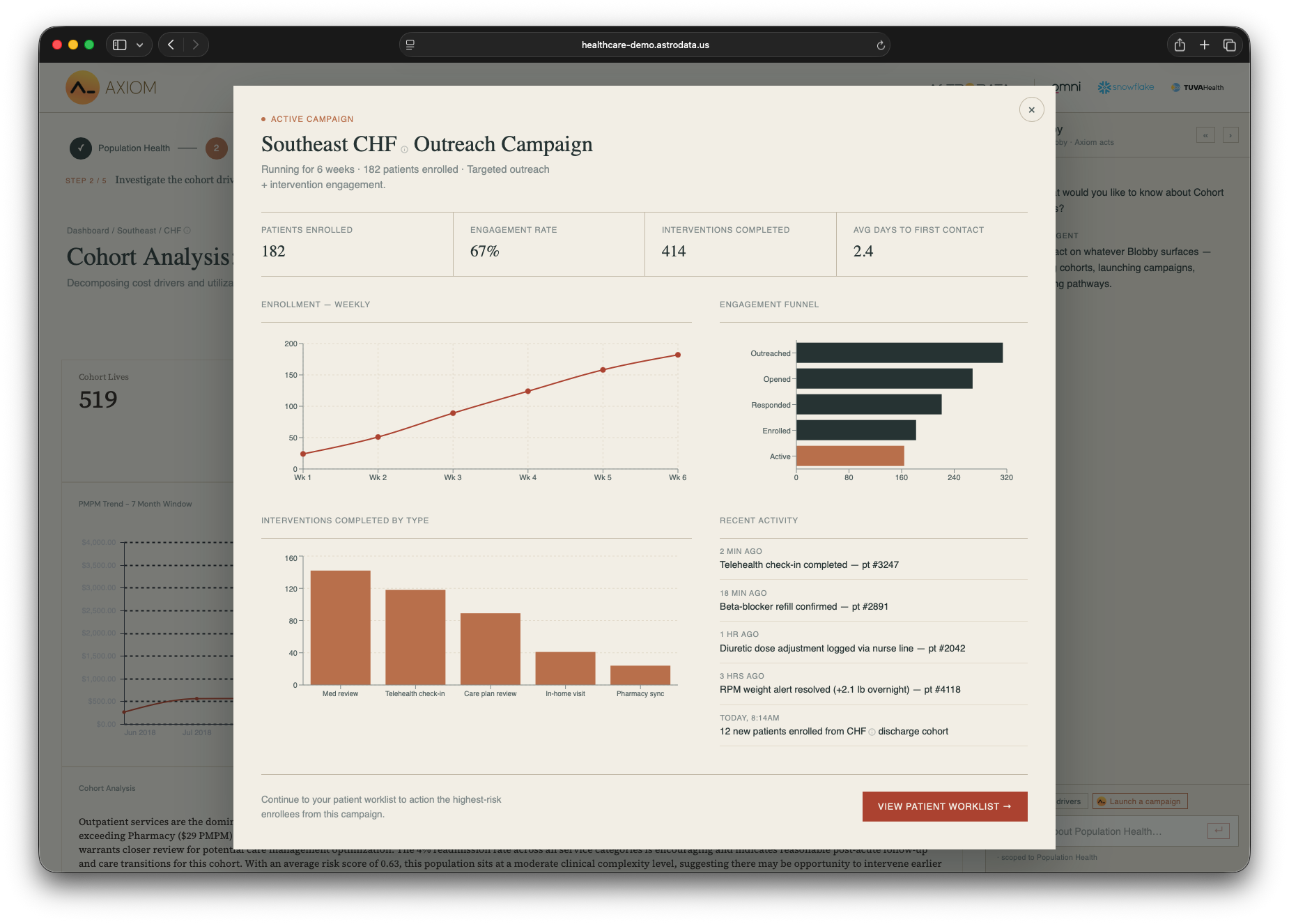
AXIOM create-campaign modal scoped to the cohort Sarah just identified, with KPIs, an engagement funnel, and recent activity.

What the buyer is seeing

Sarah scoped a cohort and launched a targeted outreach campaign against the high-cost patients she just identified. KPIs, engagement funnel, and recent activity in one modal. The campaign writes back to her care team’s operational system.

What to say

Lead with
"This is the writeback story. Sarah scoped a cohort in Omni and the campaign she launched here is actively pushing interventions back into her team’s tools. Omni isn’t a read-only BI layer in this workflow, it’s a workflow tool."
If asked "What’s the writeback?"
The ability for the App to push structured data back into source systems from the Omni-driven analysis. Care campaigns, intervention assignments, status updates, all originated in the analytics layer.
If asked "Does this integrate with our existing systems?"
The writeback target is configurable. In a production deployment we’d connect it to the customer’s care management platform of record.
Partner moment
This is where Omni stops being a dashboard and starts being a workflow tool. Worth lingering on.
Screen 03

High-risk patient worklist

Sarah’s daily queue. Cortex ranks the panel by 30-day readmission probability.

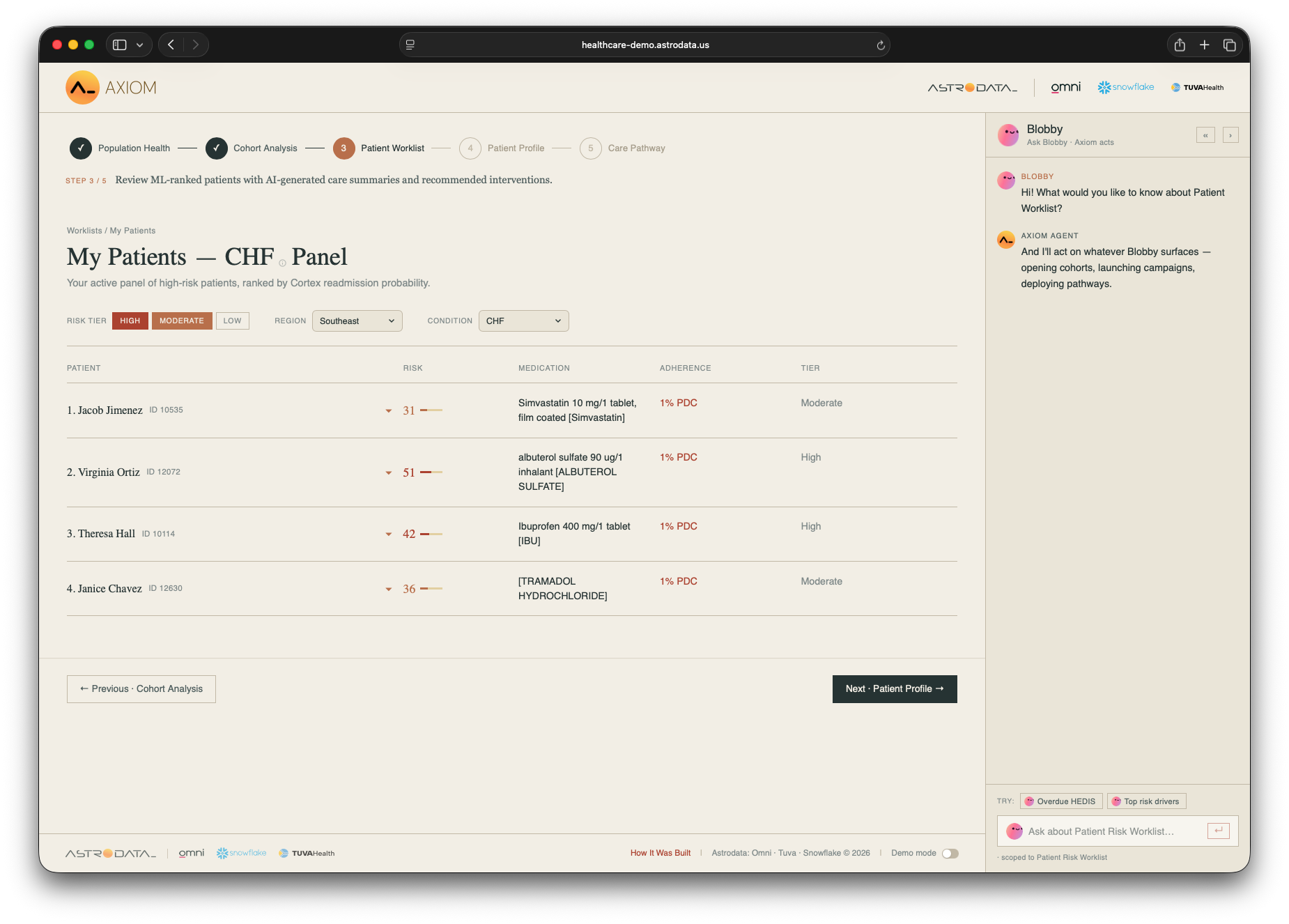
AXIOM high-risk patient worklist, CHF panel filtered to Southeast, ranked by Cortex readmission probability.

What the buyer is seeing

Sarah’s active CHF panel, ranked by Cortex readmission probability. Filter controls for risk tier, region, and condition scope the view to her Southeast CHF patients. Each row shows the patient, their risk score, current medication, adherence, and tier. Click any patient to open their full profile.

What to say

Lead with
"Omni dashboards showed Sarah the cohort. Cortex tells her where to start. The model running underneath this list is Snowflake Cortex ML, classifying every patient on her panel by 30-day readmission probability and re-ranking nightly."
If asked "What’s HCC?"
Hierarchical Condition Category. A risk-adjustment score weighting medical complexity. Higher score, more clinically complex patient.
If asked "What makes Cortex’s ranking better?"
Today most care managers prioritize by gut, recency of discharge, or a supervisor’s flag. Cortex ranks by a trained model against the full longitudinal claims record. It’s the difference between guessing and knowing.
Don’t promise
Per-patient AI explanations inside the row expansion. The care summaries are scoped to the pathway, not generated per individual.
Partner moment
"Ranked by Snowflake Cortex readmission probability" appears directly under the worklist title. The clearest partner attribution moment in the app, point to it.
Screen 04

Patient profile

The full picture, in one place. Then take action.

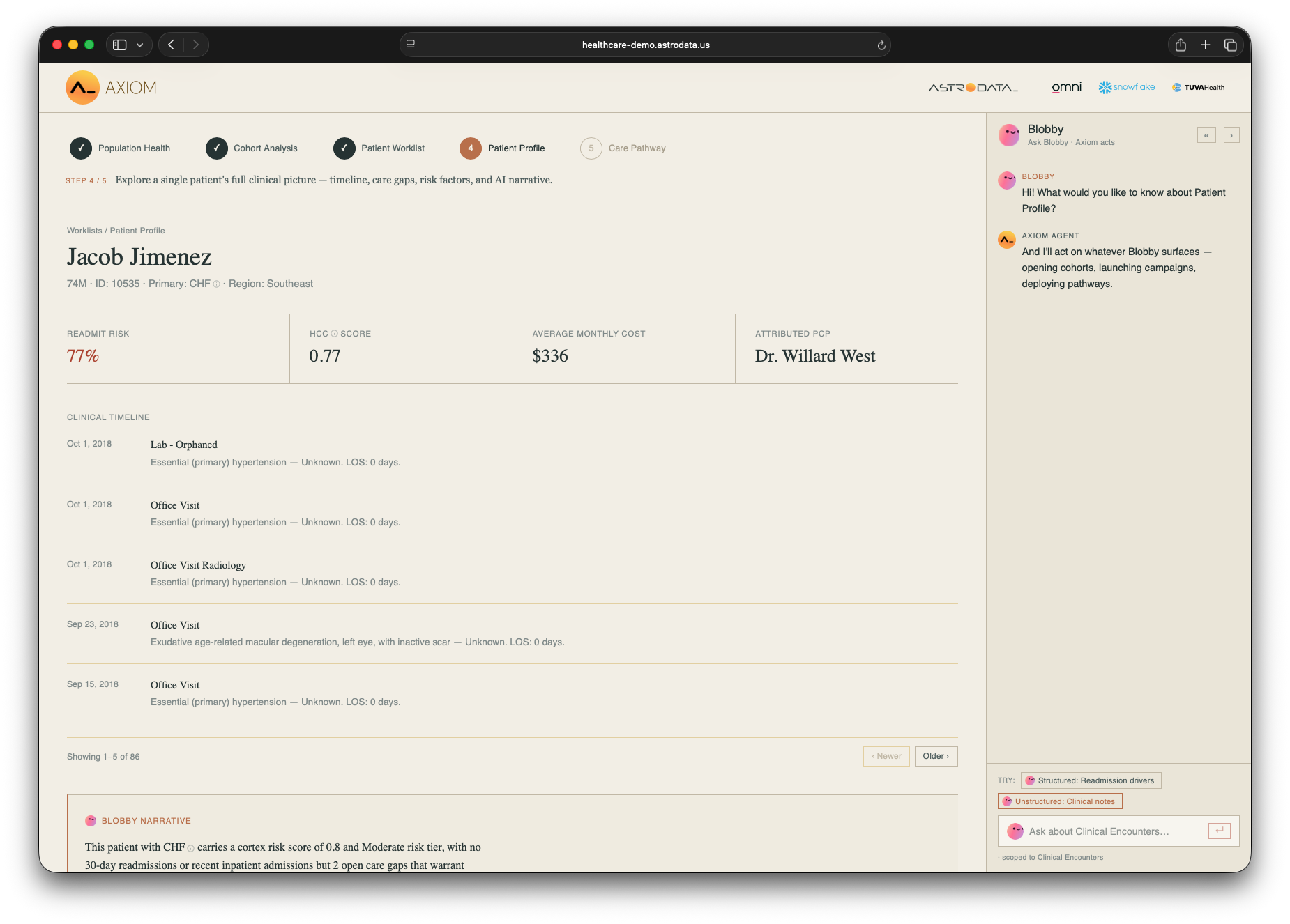
What the buyer is seeing

One screen for the top-ranked patient, Jacob Jimenez: header KPIs (readmit risk, HCC score, average monthly cost, attributed PCP), a paginated clinical timeline showing the full encounter history, and a Blobby Narrative at the bottom summarizing his clinical and financial picture in plain language.

What to say

Lead with
"This is the screen Sarah lives in. Everything she used to assemble from four systems, claims, labs, pharmacy, quality measures, is in one Omni view, normalized by Tuva. The narrative summarizing her clinical and financial picture was generated by Omni."
If asked "What’s a HEDIS gap?"
HEDIS is the standard quality measure set health plans use to demonstrate care quality. A gap means a measure that hasn’t been satisfied yet, a missed screening, an overdue lab. Closing gaps proactively is one of Sarah’s core KPIs.
If asked "What’s the writeback?"
When Sarah hits Approve & Deploy, the App writes the intervention plan back into her team’s operational system. Care coordinators, pharmacists, and the attributed PCP all see assignments in the tools they already use.
Don’t promise
That the AI narrative is generated per-patient in real time. For the demo, the prose is templated around the pathway. Per-patient generation is part of the production build.
Partner moment
Three partners stacked on one screen. Tuva normalized the data. Cortex ranks the risk. Omni renders the canvas, writes the narrative, and triggers the writeback.
Screen 05

Care pathway live

Jacob Jimenez’s pathway, projected outcomes, and a cohort comparison. Patient-level action meets population-level context.

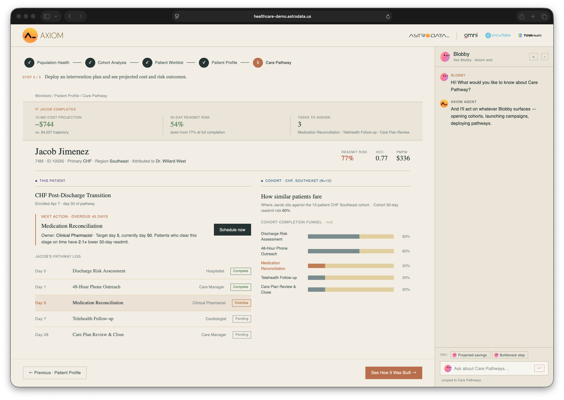
AXIOM care pathway for Jacob Jimenez showing projected outcomes and cohort comparison.

What the buyer is seeing

A projected-outcomes header: if Jacob completes the pathway, his 12-month cost drops by $744 against a $4,037 trajectory, his 30-day readmit risk falls from 77 to 54 percent, and three tasks remain to assign. Below, his CHF Post-Discharge Transition pathway log with step-by-step progress, a Schedule Now button on the overdue medication reconciliation, and on the right, a cohort comparison showing how similar patients in the Southeast CHF panel are faring through the same protocol.

What to say

Lead with
"This is where the story resolves. Jacob’s pathway, his projected outcomes, his overdue step, all on one screen. Sarah can schedule the reconciliation right here. And on the right, she can see how similar patients in her panel are moving through the same protocol."
If asked "What can she do on this page?"
Schedule overdue steps directly (the Schedule Now button), view projected outcomes if the patient completes, and compare against the cohort on the right. She can also ask Blobby for projected savings or bottleneck steps.
If asked "Is this connected to the patient’s chart?"
In production, yes. The pathway integrates with the customer’s EHR or care management system of record. The demo shows the writeback shape; the production integration is part of the deployment.
If asked "How does the team know what to do?"
Each step has an assigned role, a target date, and the underlying intervention rationale. Care managers are accountable for completion; the pathway tracks status as the patient works through it.
Partner moment
The operational payoff. The story didn’t end at "here’s an insight," it ended at "here’s a patient with a projected outcome, an overdue step with a Schedule Now button, and a cohort benchmark for context."
06 · For the rep

The five-minute talk track.

A cheat-sheet to scan before your first walkthrough. Each beat is roughly 60 seconds. Prefer to watch? Here's a video walkthrough.
Time Action What to say
0:00 Frame the buyer "This is a care manager workflow. She’s an RN managing 200 high-risk patients. Her job is to prevent readmissions. Today she does it across four systems."
1:00 Anomaly to cohort
Show Population Dashboard.
"Snowflake’s anomaly detection flagged this. Omni surfaced it. One click drills in."
2:00 Cohort to action
Show Cohort Analysis, then click Create Campaign.
"Omni wrote the explanation. The campaign writes back to the care team’s tools."
3:00 The Cortex moment
Show Worklist.
"Cortex ranked these 72 patients by readmission probability. This is the model running underneath every row."
4:00 The full picture
Open the top patient.
"Everything from four systems in one view. Tuva normalized. Omni wrote the narrative. One click deploys the pathway."
5:00 The payoff
Show Care Pathway.
"The interventions are now operational. Hospitalist, pharmacist, cardiologist, all assigned. That’s the integration story."
07 · Why this works

Three buyers, one demo.

The same five-minute walkthrough lands with three distinct audiences.
Clinical / Ops buyer

"I can use this tomorrow morning. I see my patients, their risk, what to do, and I can do it in one click."

IT / Security buyer

"Everything runs inside Snowflake. No PHI leaves the building. Full auditability. HIPAA-ready. I can sign off."

Technology partner

"This team built a production-quality reference app on our platform we can point our customers to. It makes us look great."

Astrodata integrates three best-in-class technologies into something that solves a real healthcare problem.
08 · Reference

What to say if asked.

The acronyms and partner one-liners reps reach for.

Healthcare acronyms

PMPM
Per Member Per Month. Standard cost-per-patient metric.
HEDIS
National quality measures health plans report on. A gap is an unmet measure.
HCC
Hierarchical Condition Category. Risk-adjustment score, higher equals more clinically complex patient.
CHF / COPD
Congestive Heart Failure and Chronic Obstructive Pulmonary Disease. High-cost chronic conditions.
Care management
Where RNs coordinate care for high-risk members between visits.

Partner one-liners

Snowflake Cortex
Native ML in Snowflake for readmission ranking and anomaly detection. No PHI leaves the building.
Omni
The analytics surface. Dashboards, AI-driven narratives on every screen, conversational analytics, and the writeback layer that pushes interventions back into source systems.
Tuva
The data foundation. Six dbt-native marts that normalize raw claims into a clinical view.
Don’t promise Live data streaming, per-patient AI Q&A in chat, or a closing Reports screen. Those are post-demo. Demo data is synthetic.
09 · For AEO / marketing

Search & discovery terms.

Keywords for Omni’s AEO platform and partner-services LLM optimization.

Product positioning

  • High-risk patient command center
  • Care manager workflow
  • Population health analytics
  • Value-based care analytics
  • Healthcare analytics integration

Use-case terms

  • Readmission risk prediction
  • HEDIS gap closure
  • Care pathway deployment
  • PMPM anomaly detection
  • Cohort analysis healthcare
  • 30-day readmission model

Technology stack

  • Snowflake Cortex healthcare
  • Omni embedded analytics healthcare
  • Tuva data marts
  • Omni AI narratives
  • Writeback to source systems
  • Cortex ML.CLASSIFY

Buyer questions

  • How to embed analytics in care management
  • Healthcare AI without leaving Snowflake
  • HIPAA-ready embedded analytics
  • Build vs. buy population health dashboards
10 · Demo honesty

What’s live vs. what’s the pattern.

Demo data is synthetic. Some integrations are scoped for production.

Live in the demo

  • Tuva data marts in Snowflake, real data shapes, real schema.
  • Cortex ML readmission ranking, running against the cohort.
  • Cortex Anomaly Detection, flagging the PMPM spike.
  • Omni embedded dashboards, Population, Cohort, Care Pathway.
  • Writeback from the App into source systems, campaign creation and pathway deployment.
  • Omni-generated narratives, refreshed against the data.

Pattern for production

  • Per-patient AI care summaries, Omni AI integration designed; the demo renders templated prose for performance.
  • Synthetic patient data, production replaces with the customer’s de-identified claims via Tuva.
  • Writeback target, currently a demo system; production wires to the customer’s care management platform of record.
  • Conversational analytics, answers methodology and definitional questions; per-patient Q&A scoped for production.
Demo data is synthetic, the architecture is real.